Feedback widget for Starlight
PushFeedback collects user feedback directly from your website. This guide covers installation in a Starlight (Astro) project.
Prerequisites
Before you begin, you need:
- A PushFeedback account. If you don't have one, sign up for free.
- A project created in your PushFeedback dashboard. If you haven't created one yet, follow the steps in the Quickstart guide.
- A Starlight site.
Installation
-
Go to
src/components. Ifcomponentsdoes not exist, create the directory. -
Create a new file
CustomFooter.astrounder your docs projectsrc/componentsdirectory with the following content:---import type { Props } from '@astrojs/starlight/props';import EditLink from 'virtual:starlight/components/EditLink';import LastUpdated from 'virtual:starlight/components/LastUpdated';import Pagination from 'virtual:starlight/components/Pagination';import config from 'virtual:starlight/user-config';---<footer class="sl-flex"><feedback-buttonproject="<YOUR_PROJECT_ID>"button-position="bottom-right"modal-position="bottom-right"button-style="dark">Feedback</feedback-button><div class="meta sl-flex"><EditLink {...Astro.props} /><LastUpdated {...Astro.props} /></div><Pagination {...Astro.props} />{config.credits && (<a class="kudos sl-flex" href="https://starlight.astro.build"><Icon name={'starlight'} /> {Astro.locals.t('builtWithStarlight.label')}</a>)}</footer><style is:global>.right-sidebar-container{z-index: -1;}</style><style>footer {flex-direction: column;gap: 1.5rem;}.meta {gap: 0.75rem 3rem;justify-content: space-between;flex-wrap: wrap;font-size: var(--sl-text-sm);color: var(--sl-color-gray-3);}.meta > :global(p:only-child) {margin-inline-start: auto;}.kudos {align-items: center;gap: 0.5em;margin: 1.5rem auto;font-size: var(--sl-text-xs);text-decoration: none;color: var(--sl-color-gray-3);}.kudos :global(svg) {color: var(--sl-color-orange);}.kudos:hover {color: var(--sl-color-white);}</style>This code snippet shows how to integrate the PushFeedback widget. Pay special attention to the lines:
<feedback-buttonproject="<YOUR_PROJECT_ID>"button-position="bottom-right"modal-position="bottom-right"button-style="dark">Feedback</feedback-button>Replace
<YOUR_PROJECT_ID>with your project's ID from the PushFeedback dashboard.And the global style:
<style is:global>.right-sidebar-container{z-index: -1;}</style>This is required to make sure the button is placed on top of the right sidebar.
-
Load the dependencies in your Astro configuration file (
astro.config.mjs):import starlight from '@astrojs/starlight'import { defineConfig } from 'astro/config'export default defineConfig({integrations: [starlight({head: [{tag: 'link',attrs: {rel: 'stylesheet',href: 'https://cdn.jsdelivr.net/npm/pushfeedback/dist/pushfeedback/pushfeedback.css',},},{tag: 'script',attrs: {type: 'module',src: 'https://cdn.jsdelivr.net/npm/pushfeedback/dist/pushfeedback/pushfeedback.esm.js',},},],(...)}),],}) -
Load the custom component you've created by overriding the default footer with
CustomFooter.astro:import starlight from '@astrojs/starlight'import { defineConfig } from 'astro/config'export default defineConfig({integrations: [starlight({(...)components: {Footer: './src/components/CustomFooter.astro',},(...)}),],}) -
Start your Starlight project by running
npm run devin your terminal. Once it compiles successfully, verify that the feedback button appears and functions correctly on your site.
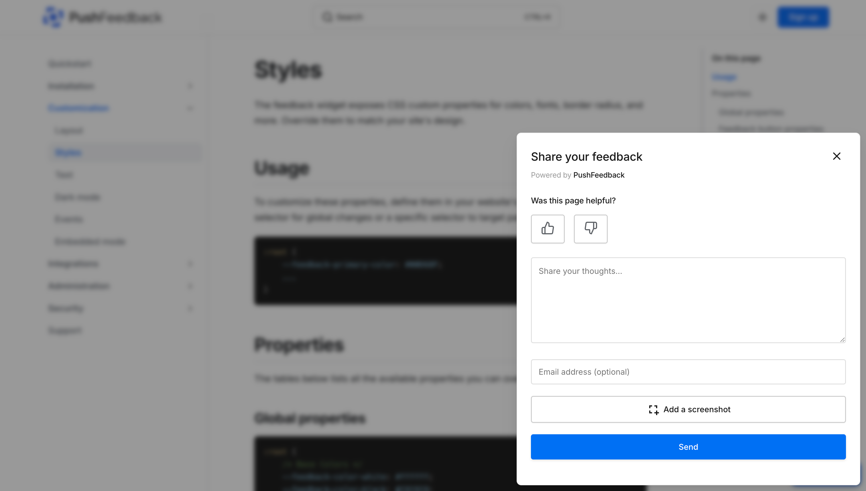
Advanced setup: Like and dislike buttons
To embed PushFeedback with like and dislike buttons at the end of every page:

Follow the previous steps, but replace the following code in your CustomFooter.astro file:
<feedback-button
    project="<YOUR_PROJECT_ID>"
    button-position="bottom-right"
    modal-position="bottom-right"
    button-style="dark">
        Feedback
</feedback-button>
With the following:
<div className="feedback-widget">
    <div style="margin-bottom: 10px;"><b>Was this helpful?</b></div>
    <span class="feedback-widget-positive" title="Yes">
        <feedback-button project="<YOUR_PROJECT_ID>" rating="1" button-style="default" modal-position="center">
            <LinkButton variant="secondary">
                <svg xmlns="http://www.w3.org/2000/svg" width="20" height="20" viewBox="0 0 24 24" fill="none" stroke="currentColor" strokeWidth="2" strokeLinecap="round" strokeLinejoin="round">
                    <path d="M14 9V5a3 3 0 0 0-3-3l-4 9v11h11.28a2 2 0 0 0 2-1.7l1.38-9a2 2 0 0 0-2-2.3zM7 22H4a2 2 0 0 1-2-2v-7a2 2 0 0 1 2-2h3"></path>
                </svg>
            </LinkButton>
        </feedback-button>
    </span>
    <span class="feedback-widget-negative">
        <feedback-button project="<YOUR_PROJECT_ID>" rating="0" button-style="default" modal-position="center">
            <LinkButton variant="secondary" title="No">
                <svg xmlns="http://www.w3.org/2000/svg" width="20" height="20" viewBox="0 0 24 24" fill="none" stroke="currentColor" strokeWidth="2" strokeLinecap="round" strokeLinejoin="round">
                    <path d="M10 15v4a3 3 0 0 0 3 3l4-9V2H5.72a2 2 0 0 0-2 1.7l-1.38 9a2 2 0 0 0 2 2.3zm7-13h2.67A2.31 2.31 0 0 1 22 4v7a2.31 2.31 0 0 1-2.33 2H17"></path>
                </svg>
            </LinkButton>
        </feedback-button>
    </span>
</div>
Remember to replace <YOUR_PROJECT_ID> with your project's ID from the PushFeedback dashboard.
Next steps
Choose what to do next:
- Customization — Adjust the widget's layout, styles, and text.
- Integrations — Forward feedback to Slack, email, Jira, and more.