Feedback widget for Fumadocs
PushFeedback collects user feedback directly from your website. This guide covers installation in a Fumadocs project.
Prerequisites
Before you begin, you need:
- A PushFeedback account. If you don't have one, sign up for free.
- A project created in your PushFeedback dashboard. If you haven't created one yet, follow the steps in the Quickstart guide.
- A Fumadocs site and Node.js installed.
Installation
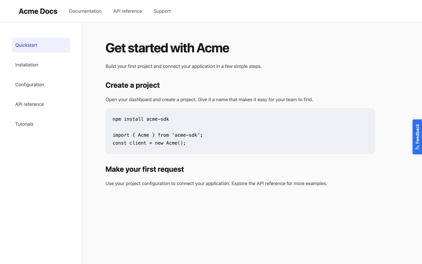
Floating button
-
Install PushFeedback:
npm install pushfeedback-reactinfoIf you're using pnpm as your package manager, run
pnpm add pushfeedback-reactinstead of the npm command above. -
Create a new component file
components/feedback-widget.tsxwith the following content:'use client';import React, { useEffect } from 'react';import { FeedbackButton } from 'pushfeedback-react';import { defineCustomElements } from 'pushfeedback/loader';import 'pushfeedback/dist/pushfeedback/pushfeedback.css';export function FeedbackWidget() {useEffect(() => {if (typeof window !== 'undefined') {defineCustomElements(window);}}, []);return (<FeedbackButtonproject="<YOUR_PROJECT_ID>"button-position="bottom-right"modal-position="bottom-right"button-style="dark"custom-font="true">Feedback</FeedbackButton>);}Replace
<YOUR_PROJECT_ID>with your project's ID from the PushFeedback dashboard. -
Import and add the
FeedbackWidgetcomponent to your root layout file (app/layout.tsx):import { FeedbackWidget } from '@/components/feedback-widget';export default function RootLayout({children,}: {children: React.ReactNode;}) {return (<html lang="en"><body>{children}<FeedbackWidget /></body></html>);} -
Start your Fumadocs project by running
npm run devin your terminal. Once it compiles successfully, verify that the feedback button appears and functions correctly on your site.
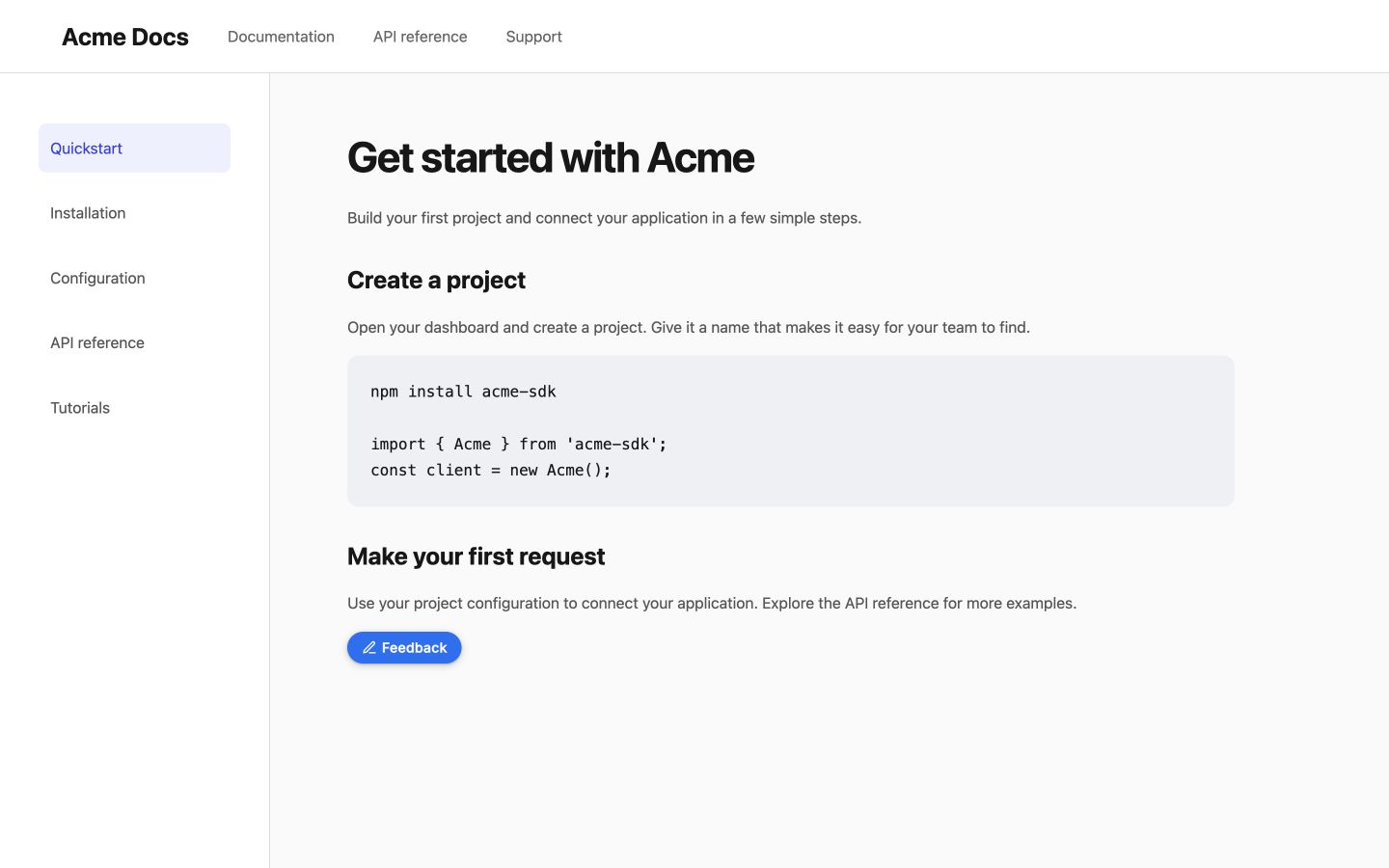
Inline button
Install pushfeedback-react if it is not already in your project:
npm install pushfeedback-react
Create InlineFeedback.jsx with the widget stylesheet, loader, and component:
'use client';

import React, { useEffect } from 'react';
import { FeedbackButton } from 'pushfeedback-react';
import { defineCustomElements } from 'pushfeedback/loader';
import 'pushfeedback/dist/pushfeedback/pushfeedback.css';

export default function InlineFeedback({ project }) {
  useEffect(() => { defineCustomElements(window); }, []);
  return <FeedbackButton project={project} button-position="default" modal-position="center" button-style="dark">Feedback</FeedbackButton>;
}
Render <InlineFeedback project="<YOUR_PROJECT_ID>" /> where you want it in the content.
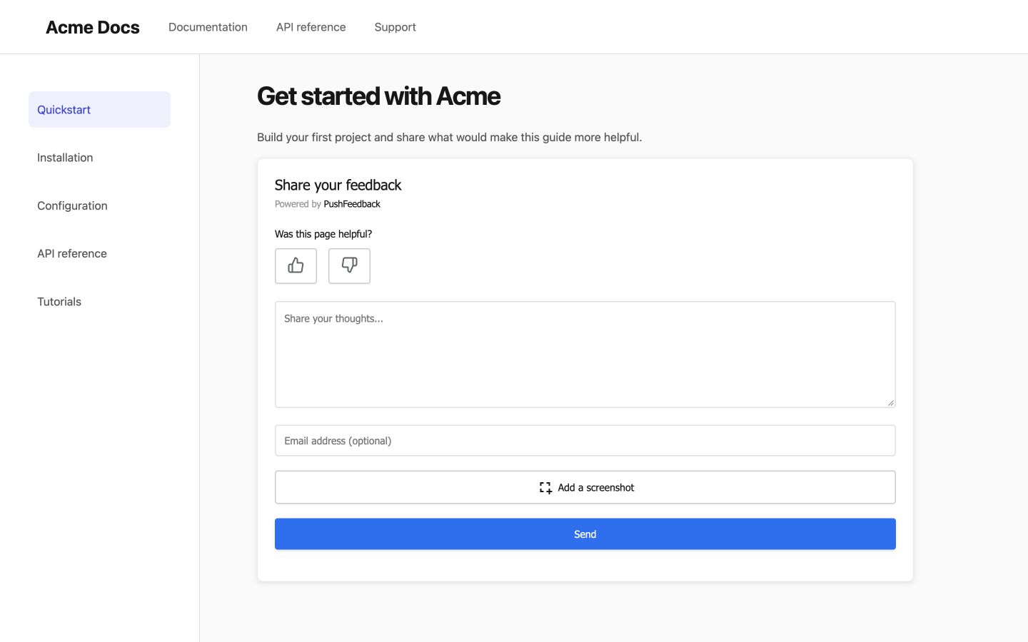
Embedded form
Install pushfeedback-react if it is not already in your project:
npm install pushfeedback-react
Create EmbeddedFeedback.jsx with the widget stylesheet, loader, and component:
'use client';

import React, { useEffect } from 'react';
import { FeedbackModal } from 'pushfeedback-react';
import { defineCustomElements } from 'pushfeedback/loader';
import 'pushfeedback/dist/pushfeedback/pushfeedback.css';

export default function EmbeddedFeedback({ project }) {
  useEffect(() => { defineCustomElements(window); }, []);
  return <FeedbackModal project={project} embedded="true" />;
}
Render <EmbeddedFeedback project="<YOUR_PROJECT_ID>" /> where you want it in the content.
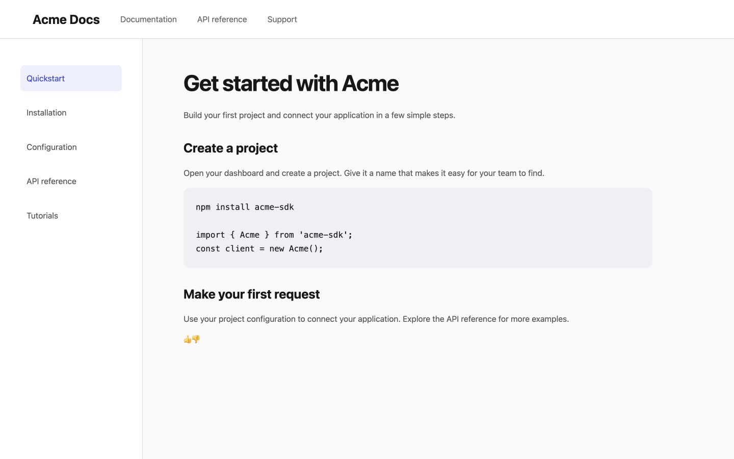
Like and dislike buttons
Install pushfeedback-react if it is not already in your project:
npm install pushfeedback-react
Create FeedbackThumbs.jsx with the widget stylesheet, loader, and component:
'use client';

import React, { useEffect } from 'react';
import { FeedbackButton } from 'pushfeedback-react';
import { defineCustomElements } from 'pushfeedback/loader';
import 'pushfeedback/dist/pushfeedback/pushfeedback.css';

export default function FeedbackThumbs({ project }) {
  useEffect(() => { defineCustomElements(window); }, []);

  return (
    <div>
      <p>Was this helpful?</p>
      <div className="pushfeedback-thumbs-row">
        <FeedbackButton project={project} rating="1" button-position="default" modal-position="center" button-style="default" custom-font="true">
          <span className="pushfeedback-thumb-label">Helpful</span>
          <svg xmlns="http://www.w3.org/2000/svg" width="24" height="24" viewBox="0 0 24 24" fill="none" stroke="currentColor" strokeWidth="2" strokeLinecap="round" strokeLinejoin="round" aria-hidden="true"><path d="M14 9V5a3 3 0 0 0-3-3l-4 9v11h11.28a2 2 0 0 0 2-1.7l1.38-9a2 2 0 0 0-2-2.3zM7 22H4a2 2 0 0 1-2-2v-7a2 2 0 0 1 2-2h3" /></svg>
        </FeedbackButton>
        <FeedbackButton project={project} rating="0" button-position="default" modal-position="center" button-style="default" custom-font="true">
          <span className="pushfeedback-thumb-label">Not helpful</span>
          <svg xmlns="http://www.w3.org/2000/svg" width="24" height="24" viewBox="0 0 24 24" fill="none" stroke="currentColor" strokeWidth="2" strokeLinecap="round" strokeLinejoin="round" aria-hidden="true"><path d="M10 15v4a3 3 0 0 0 3 3l4-9V2H5.72a2 2 0 0 0-2 1.7l-1.38 9a2 2 0 0 0 2 2.3zm7-13h2.67A2.31 2.31 0 0 1 22 4v7a2.31 2.31 0 0 1-2.33 2H17" /></svg>
        </FeedbackButton>
      </div>
    </div>
  );
}
Render <FeedbackThumbs project="<YOUR_PROJECT_ID>" /> after the article content.
Next steps
Choose what to do next:
- Customization — Adjust the widget's layout, styles, and text.
- Integrations — Forward feedback to Slack, email, Jira, and more.