Feedback widget for Docusaurus
PushFeedback collects user feedback directly from your website. This guide covers installation in a Docusaurus project using the official plugin.
Prerequisites
Before you begin, you need:
- A PushFeedback account. If you don't have one, sign up for free.
- A project created in your PushFeedback dashboard. If you haven't created one yet, follow the steps in the Quickstart guide.
- A Docusaurus site and Node.js installed.
Installation
-
Install PushFeedback:
- Docusaurus 3.x
- Docusaurus 2.X
npm install docusaurus-pushfeedback
npm install docusaurus-pushfeedback@0.1.7
-
Add the plugin to your Docusaurus config file
docusaurus.config.js:plugins: [['docusaurus-pushfeedback',{project: '<YOUR_PROJECT_ID>'}]],Replace
<YOUR_PROJECT_ID>with your project's ID from the PushFeedback dashboard. -
Start your Docusaurus project by running
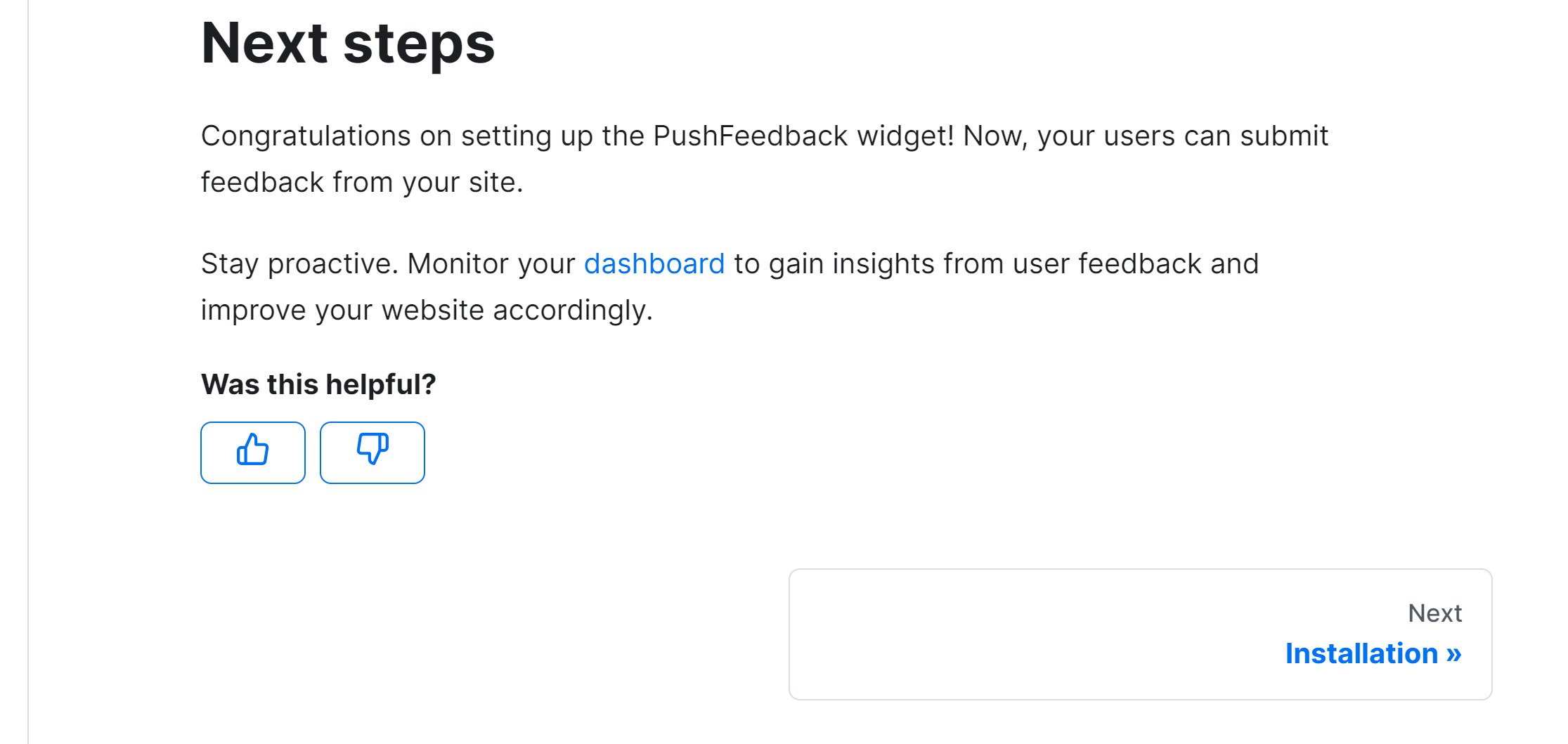
npm startoryarn startin your terminal. Once it compiles successfully, verify that the feedback button appears and functions correctly on your site.
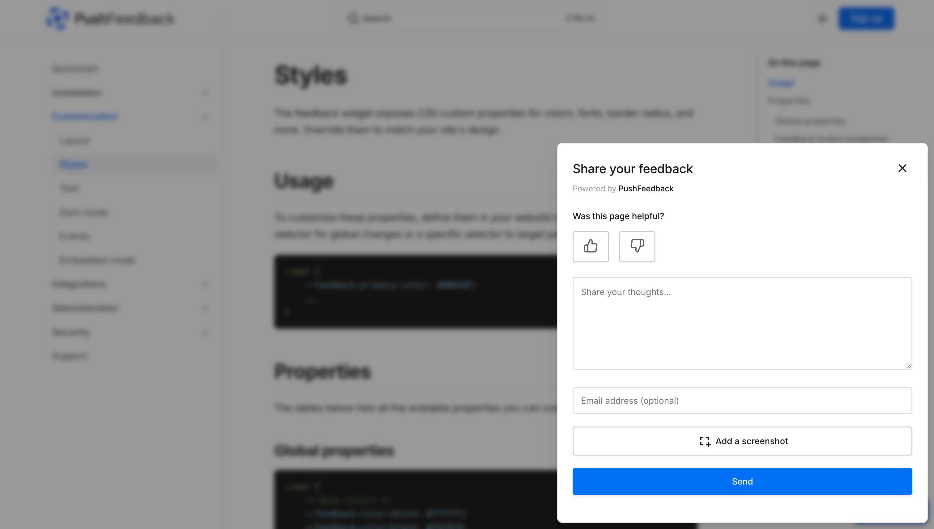
Customization
You can change the widget's position, color, and more. Add any configuration and text option to the plugin, formatted as camelCase.
Here's an example:
plugins: [
    [
        'docusaurus-pushfeedback',{
            project: '<YOUR_PROJECT_ID>',
            buttonPosition: 'center-right',
            modalPosition: 'sidebar-right',
            buttonStyle: 'dark',
            modalTitle: 'Share your thoughts'
        }
    ]
],
To further customize the style of the PushFeedback widget in Docusaurus, such as altering the widget's background color, you can override specific CSS properties. This is done by defining these properties in a custom stylesheet. Here's how you can do it:
-
In your project's
srcdirectory, create the filecss/custom.css. -
In the
custom.cssfile, you can define your custom CSS properties. For example, to change the widget's primary color, add the following CSS rule::root {--feedback-primary-color: #FF0000; /* Replace #FF0000 with the hex color code of your choice */}For a complete reference of properties you can modify, see the Styles documentation.
-
Open your
docusaurus.config.jsfile and locate thepresetsarray and within it, theclassicpreset configuration. Then, add a reference to your custom stylesheet in the theme configuration. It should look something like this:presets: [['classic',{// ... other configurations ...theme: {customCss: require.resolve('./src/css/custom.css'), // Add this line},// ... other configurations ...},],],
Advanced setup: Like and dislike buttons
For example, you can use it to embedded PushFeedback at the end of every page as follows:
-
Install PushFeedback:
npm install pushfeedback-reacttipIn this setup, the
docusaurus-pushfeedbackpackage is not required. You can uninstall it by runningnpm uninstall docusaurus-pushfeedback. -
For Docusaurus, the best approach is to swizzle the original doc footer component to embed the PushFeedback button. Begin by using the npm run swizzle command to start the swizzle process:
npm run swizzle @docusaurus/theme-classic DocItem/FooterWhen prompted with the question:
Which swizzle action do you want to do?, choose Wrap.By choosing to wrap, Docusaurus will create a wrapper component for the Footer in the
src/themedirectory. This allows you to extend the original footer component without modifying its intrinsic content. -
After swizzling, navigate to
src/theme/DocItem/Footer/index.jsin your project directory. Now, integrate the PushFeedback button:import React, {useEffect} from 'react';import Footer from '@theme-original/DocItem/Footer';import { FeedbackButton } from 'pushfeedback-react';import { defineCustomElements } from 'pushfeedback/loader';import 'pushfeedback/dist/pushfeedback/pushfeedback.css';function FeedbackWidget() {const buttonThumbsUp = <svg xmlns="http://www.w3.org/2000/svg" width="20" height="20" viewBox="0 0 24 24" fill="none" stroke="currentColor" strokeWidth="2" strokeLinecap="round" strokeLinejoin="round"><path d="M14 9V5a3 3 0 0 0-3-3l-4 9v11h11.28a2 2 0 0 0 2-1.7l1.38-9a2 2 0 0 0-2-2.3zM7 22H4a2 2 0 0 1-2-2v-7a2 2 0 0 1 2-2h3"></path></svg>;const buttonThumbsDown = <svg xmlns="http://www.w3.org/2000/svg" width="20" height="20" viewBox="0 0 24 24" fill="none" stroke="currentColor" strokeWidth="2" strokeLinecap="round" strokeLinejoin="round"><path d="M10 15v4a3 3 0 0 0 3 3l4-9V2H5.72a2 2 0 0 0-2 1.7l-1.38 9a2 2 0 0 0 2 2.3zm7-13h2.67A2.31 2.31 0 0 1 22 4v7a2.31 2.31 0 0 1-2.33 2H17"></path></svg>;// Replace with your PROJECT_IDconst projectId = '<PROJECT_ID>';useEffect(() => {if (typeof window !== 'undefined') {defineCustomElements(window);}}, []);return(<div className="feedback-widget margin-top--md margin-bottom--md"><div className="margin-bottom--sm"><b>Was this helpful?</b></div><span className="feedback-widget-positive"><FeedbackButton project={projectId} rating="1" custom-font="True" button-style="default" modal-position="center"><button className="button button--outline button--primary button--sm" title="Yes">{buttonThumbsUp}</button></FeedbackButton></span><span className="feedback-widget-negative margin-left--sm"><FeedbackButton project={projectId} rating="0" custom-font="True" button-style="default" modal-position="center"><button className="button button--outline button--primary button--sm" title="No">{buttonThumbsDown}</button></FeedbackButton></span></div>);}export default function FooterWrapper(props) {return (<><FeedbackWidget/><Footer {...props} /></>);}Replace
<PROJECT_ID>with your project's ID from the PushFeedback dashboard. -
Start your Docusaurus project by running
npm startoryarn startin your terminal. Once it compiles successfully, verify that the feedback button appears and functions correctly on your site.
Advanced setup: Multilingual support
Example:
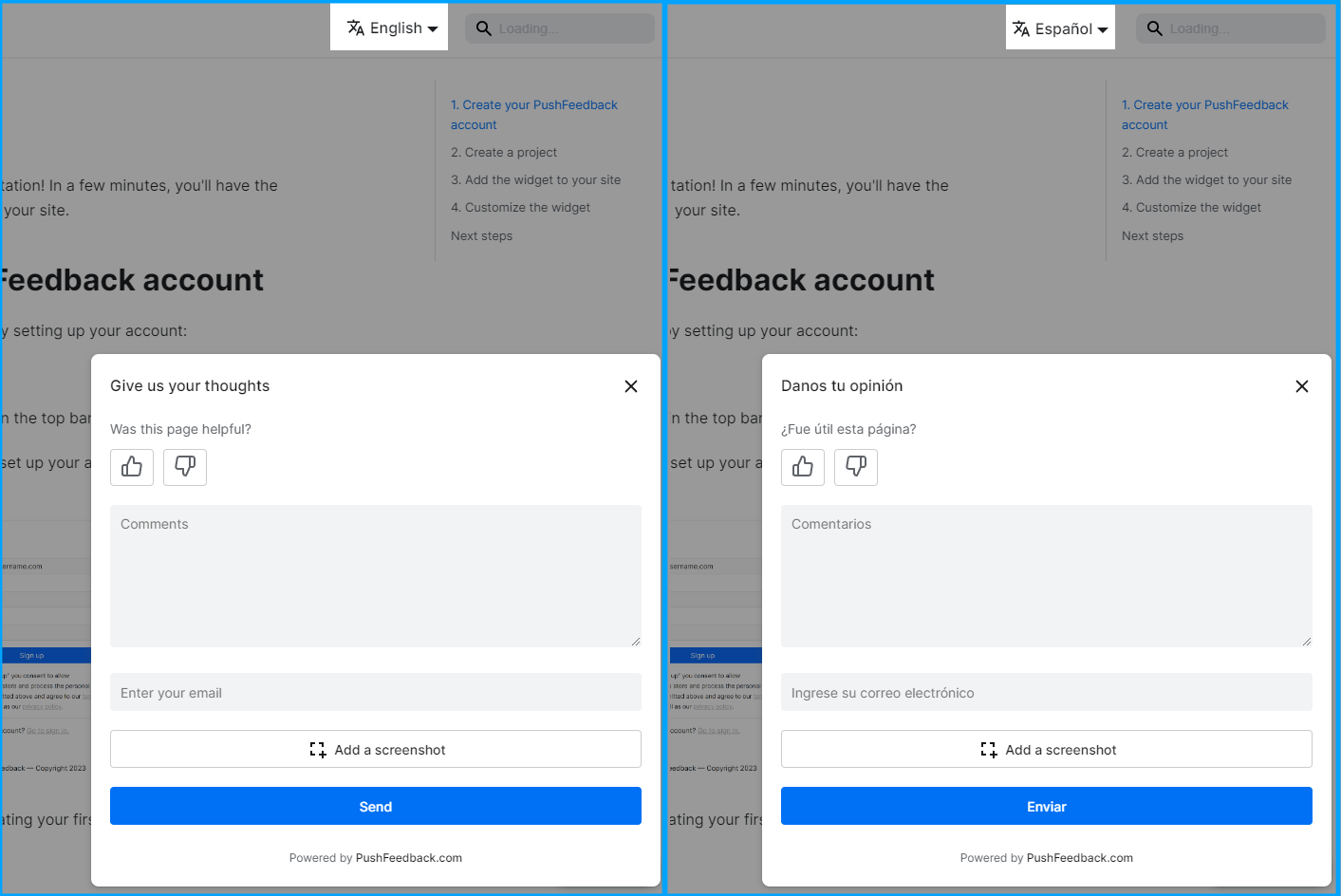
Before you start with this guide, your docusaurus site must have i18n enabled.
-
Install PushFeedback:
npm install pushfeedback-reacttipIn this setup, the
docusaurus-pushfeedbackpackage is not required. You can uninstall it by runningnpm uninstall docusaurus-pushfeedback. -
For Docusaurus, the best approach is to swizzle the original footer component to embed the PushFeedback button. This ensures the feedback button is loaded just before the closing body tag for optimal performance. Begin by using the npm run swizzle command to start the swizzle process:
npm run swizzle @docusaurus/theme-classic FooterWhen prompted with the question:
Which swizzle action do you want to do?, choose Wrap.By choosing to wrap, Docusaurus will create a wrapper component for the Footer in the
src/themedirectory. This allows you to extend the original footer component without modifying its intrinsic content. -
After swizzling, navigate to
src/theme/Footer/index.jsin your project directory. Replace the content with the following to integrate the PushFeedback button:import React, { useEffect } from 'react';import Footer from '@theme-original/Footer';import useDocusaurusContext from '@docusaurus/useDocusaurusContext';import { FeedbackButton } from 'pushfeedback-react';import { defineCustomElements } from 'pushfeedback/loader';import 'pushfeedback/dist/pushfeedback/pushfeedback.css';function FeedbackWidget() {const { i18n } = useDocusaurusContext();const language = i18n.currentLocale;// Replace with your actual project IDconst projectId = '<PROJECT_ID>';// Replace with your project supported languagesconst placeholders = {en: {feedbackButtonText: "Feedback",emailPlaceholder: "Enter your email",errorMessage: "Please try again later.",modalTitleError403: "The request URL does not match the one defined in PushFeedback for this project.",modalTitleError404: "We could not find the provided project id in PushFeedback.",messagePlaceholder: "Comments",modalTitle: "Share your feedback",modalTitleError: "Oops!",modalTitleSuccess: "Thanks for your feedback!",screenshotButtonText: "Take a Screenshot",screenshotTopbarText: "SELECT AN ELEMENT ON THE PAGE",sendButtonText: "Send",ratingPlaceholder: "Was this page helpful?",ratingStarsPlaceholder: "How would you rate this page"},es: {feedbackButtonText: "Sugerencias",emailPlaceholder: "Ingrese su correo electrónico",errorMessage: "Inténtalo de nuevo más tarde.",modalTitleError403: "La URL de solicitud no coincide con la definida en PushFeedback para este proyecto.",modalTitleError404: "No pudimos encontrar el ID del proyecto proporcionado en PushFeedback.",messagePlaceholder: "Comentarios",modalTitle: "Danos tu opinión",modalTitleError: "¡Vaya!",modalTitleSuccess: "¡Gracias por tus comentarios!",screenshotButtonText: "Tomar una captura de pantalla",screenshotTopbarText: "SELECCIONA UN ELEMENTO EN LA PÁGINA",sendButtonText: "Enviar",ratingPlaceholder: "¿Fue útil esta página?",ratingStarsPlaceholder: "¿Cómo calificarías esta página?"}};useEffect(() => {if (typeof window !== 'undefined') {defineCustomElements(window);}}, []);const {feedbackButtonText,emailPlaceholder,errorMessage,modalTitleError403,modalTitleError404,messagePlaceholder,modalTitle,modalTitleError,modalTitleSuccess,screenshotButtonText,screenshotTopbarText,sendButtonText,ratingPlaceholder,ratingStarsPlaceholder} = placeholders[language] || placeholders.en;return (<div className="feedback-widget"><FeedbackButtonproject={projectId}email-placeholder={emailPlaceholder}error-message={errorMessage}modal-title-error-4-0-3={modalTitleError403}modal-title-error-4-0-4={modalTitleError404}message-placeholder={messagePlaceholder}modal-title={modalTitle}modal-title-error={modalTitleError}modal-title-success={modalTitleSuccess}screenshot-button-text={screenshotButtonText}screenshot-topbar-text={screenshotTopbarText}send-button-text={sendButtonText}rating-placeholder={ratingPlaceholder}rating-stars-placeholder={ratingStarsPlaceholder}button-position="bottom-right"button-style="dark"modal-position="bottom-right">{feedbackButtonText}</FeedbackButton></div>);}export default function FooterWrapper(props) {return (<><Footer {...props} /><FeedbackWidget /></>);}Replace
<PROJECT_ID>with your project's ID from the PushFeedback dashboard and the placeholder strings with your project's supported languages. -
Start your Docusaurus project by running
npm startoryarn startin your terminal. Once it compiles successfully, verify that the feedback button appears and functions correctly on your site.