Feedback widget for Vue.js
PushFeedback collects user feedback directly from your website. This guide covers installation in a Vue.js project using NPM.
Prerequisites
Before you begin, you need:
- A PushFeedback account. If you don't have one, sign up for free.
- A project created in your PushFeedback dashboard. If you haven't created one yet, follow the steps in the Quickstart guide.
- A Vue.js project and Node.js installed.
Installation
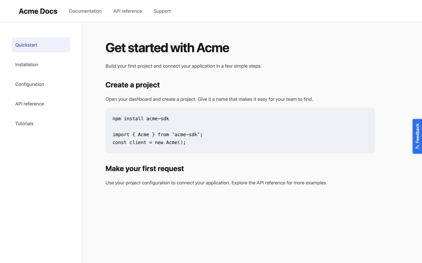
Floating button
-
Install PushFeedback:
npm install pushfeedback -
Open your main Vue component or the desired Vue component where you want the feedback widget to appear. Then, incorporate the PushFeedback styles and scripts:
<script>// Incorporate PushFeedback stylesimport 'pushfeedback/dist/pushfeedback/pushfeedback.css';// Initialize the PushFeedback widgetimport 'pushfeedback/dist/pushfeedback/pushfeedback.esm.js';</script> -
In the template section of your Vue component, add the following snippet:
<template><!-- Rest of your component's template --><feedback-buttonproject="<YOUR_PROJECT_ID>"button-position="bottom-right"modal-position="bottom-right"button-style="dark">Feedback</feedback-button></template>Replace
<YOUR_PROJECT_ID>with your project's ID from the PushFeedback dashboard. -
After making these changes, navigate back to your Vue.js project root and run:
npm run serveOpen the website in a web browser to verify that the feedback button appears and works correctly.
Inline button
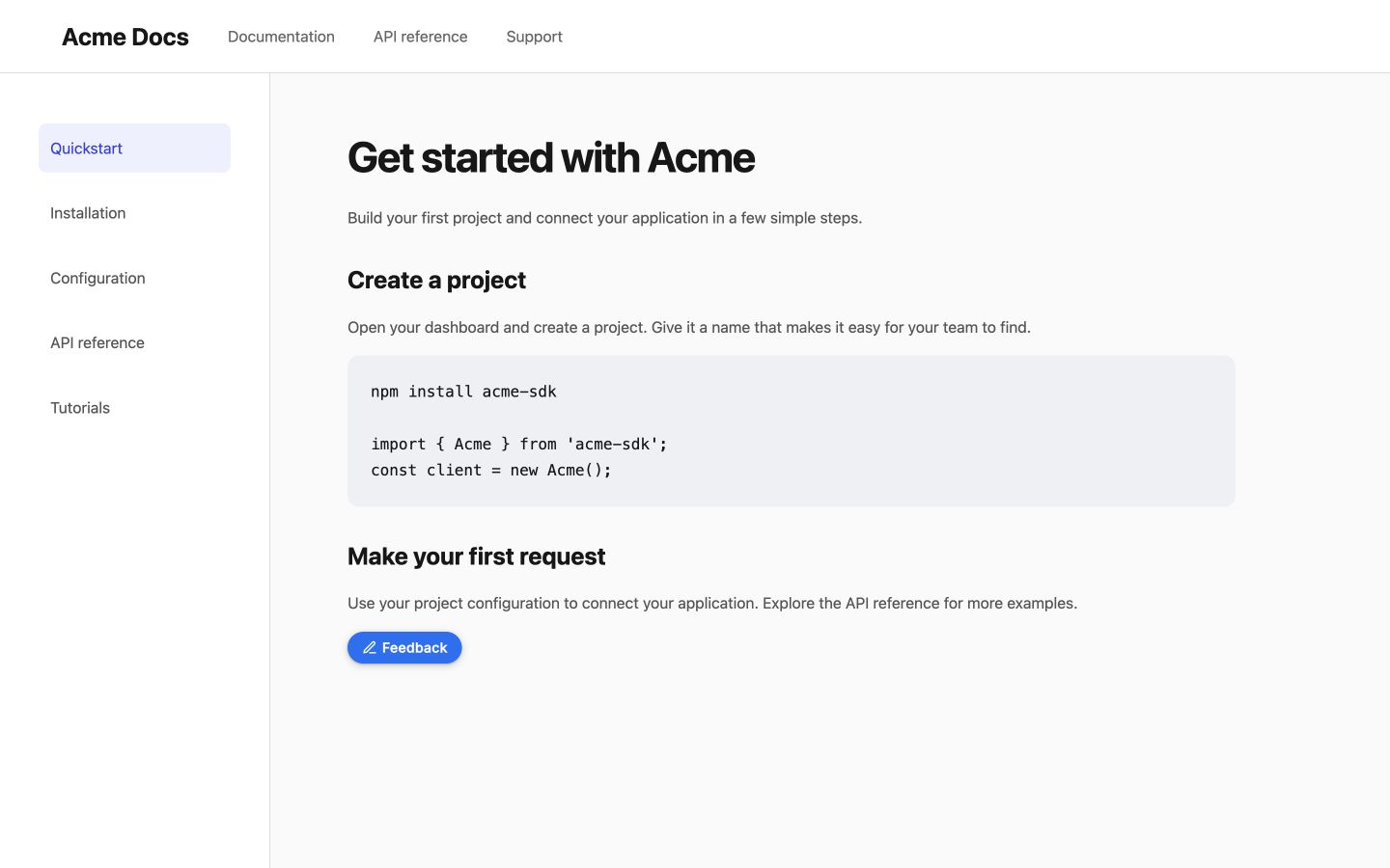
Install pushfeedback if it is not already in your project:
npm install pushfeedback
Create a Vue component with the stylesheet, loader, and widget:
<script>
import 'pushfeedback/dist/pushfeedback/pushfeedback.css';

export default {
  mounted() {
    import('pushfeedback/loader').then(({ defineCustomElements }) => defineCustomElements(window));
  },
};
</script>

<template>
  <feedback-button project="<YOUR_PROJECT_ID>" button-position="default" modal-position="center" button-style="dark">Feedback</feedback-button>
</template>
Place this component where you want the inline button in the page content.
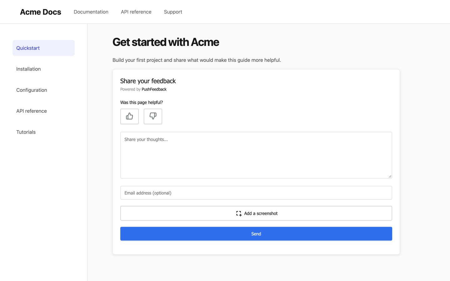
Embedded form
Install pushfeedback if it is not already in your project:
npm install pushfeedback
Create a Vue component with the stylesheet, loader, and widget:
<script>
import 'pushfeedback/dist/pushfeedback/pushfeedback.css';

export default {
  mounted() {
    import('pushfeedback/loader').then(({ defineCustomElements }) => defineCustomElements(window));
  },
};
</script>

<template>
  <feedback-modal project="<YOUR_PROJECT_ID>" embedded="true"></feedback-modal>
</template>
Place this component where you want the embedded form in the page content.
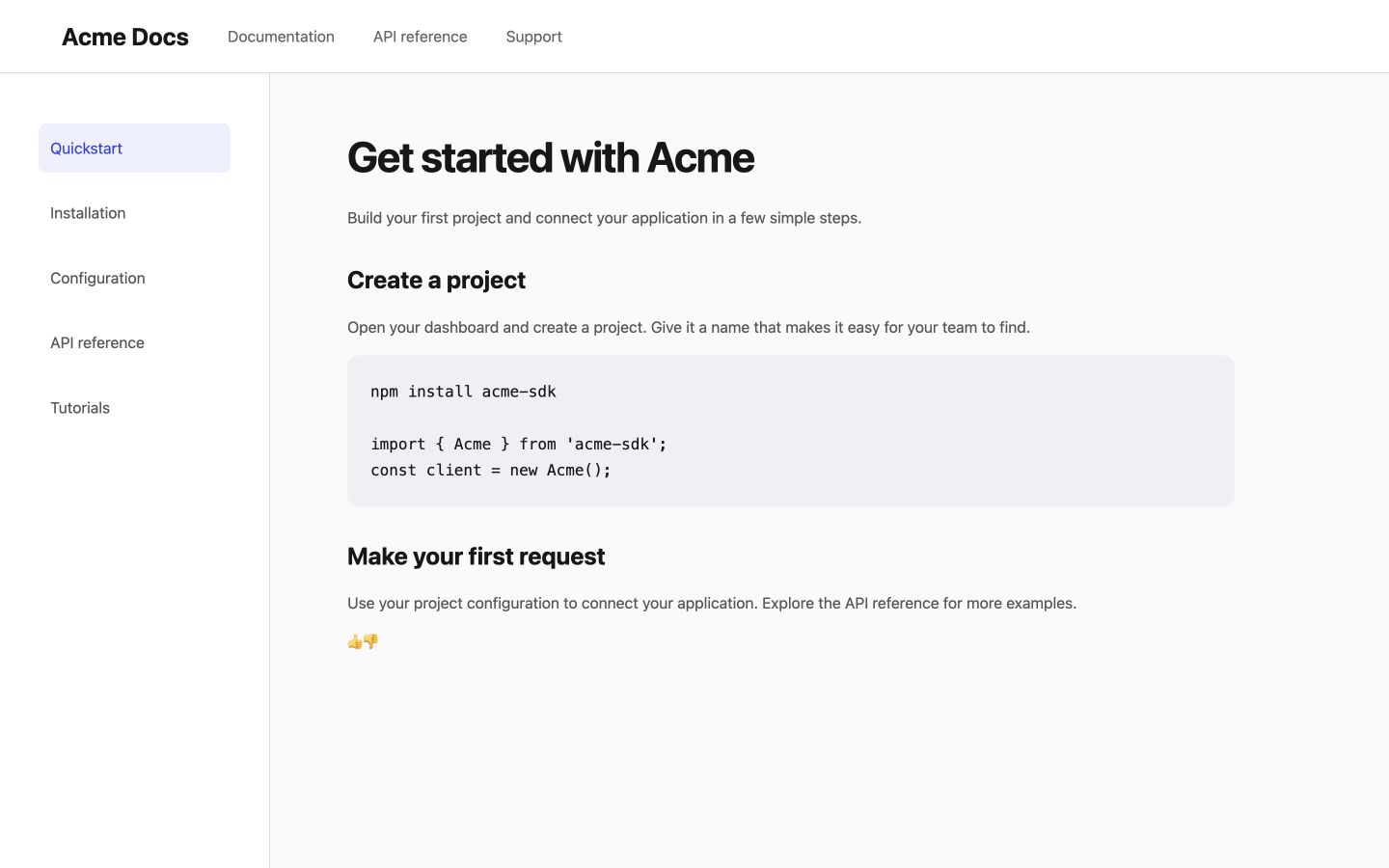
Like and dislike buttons
Install pushfeedback if it is not already in your project:
npm install pushfeedback
Create a Vue component with the stylesheet, loader, and widget:
<script>
import 'pushfeedback/dist/pushfeedback/pushfeedback.css';

export default {
  mounted() {
    import('pushfeedback/loader').then(({ defineCustomElements }) => defineCustomElements(window));
  },
};
</script>

<template>
  <div>
    <p>Was this helpful?</p>
    <div class="pushfeedback-thumbs-row">
    <feedback-button project="<YOUR_PROJECT_ID>" rating="1" button-position="default" modal-position="center" button-style="default" custom-font="true">
      <span class="pushfeedback-thumb-label">Helpful</span>
      <svg xmlns="http://www.w3.org/2000/svg" width="24" height="24" viewBox="0 0 24 24" fill="none" stroke="currentColor" stroke-width="2" stroke-linecap="round" stroke-linejoin="round" aria-hidden="true"><path d="M14 9V5a3 3 0 0 0-3-3l-4 9v11h11.28a2 2 0 0 0 2-1.7l1.38-9a2 2 0 0 0-2-2.3zM7 22H4a2 2 0 0 1-2-2v-7a2 2 0 0 1 2-2h3" /></svg>
    </feedback-button>
    <feedback-button project="<YOUR_PROJECT_ID>" rating="0" button-position="default" modal-position="center" button-style="default" custom-font="true">
      <span class="pushfeedback-thumb-label">Not helpful</span>
      <svg xmlns="http://www.w3.org/2000/svg" width="24" height="24" viewBox="0 0 24 24" fill="none" stroke="currentColor" stroke-width="2" stroke-linecap="round" stroke-linejoin="round" aria-hidden="true"><path d="M10 15v4a3 3 0 0 0 3 3l4-9V2H5.72a2 2 0 0 0-2 1.7l-1.38 9a2 2 0 0 0 2 2.3zm7-13h2.67A2.31 2.31 0 0 1 22 4v7a2.31 2.31 0 0 1-2.33 2H17" /></svg>
    </feedback-button>
    </div>
  </div>
</template>
Place this component after the article content.
Next steps
Choose what to do next:
- Customization — Adjust the widget's layout, styles, and text.
- Integrations — Forward feedback to Slack, email, Jira, and more.