Feedback widget for Gatsby
PushFeedback collects user feedback directly from your website. This guide covers installation in a Gatsby project using NPM.
Prerequisites
Before you begin, you need:
- A PushFeedback account. If you don't have one, sign up for free.
- A project created in your PushFeedback dashboard. If you haven't created one yet, follow the steps in the Quickstart guide.
- A Gatsby application and Node.js installed.
Installation
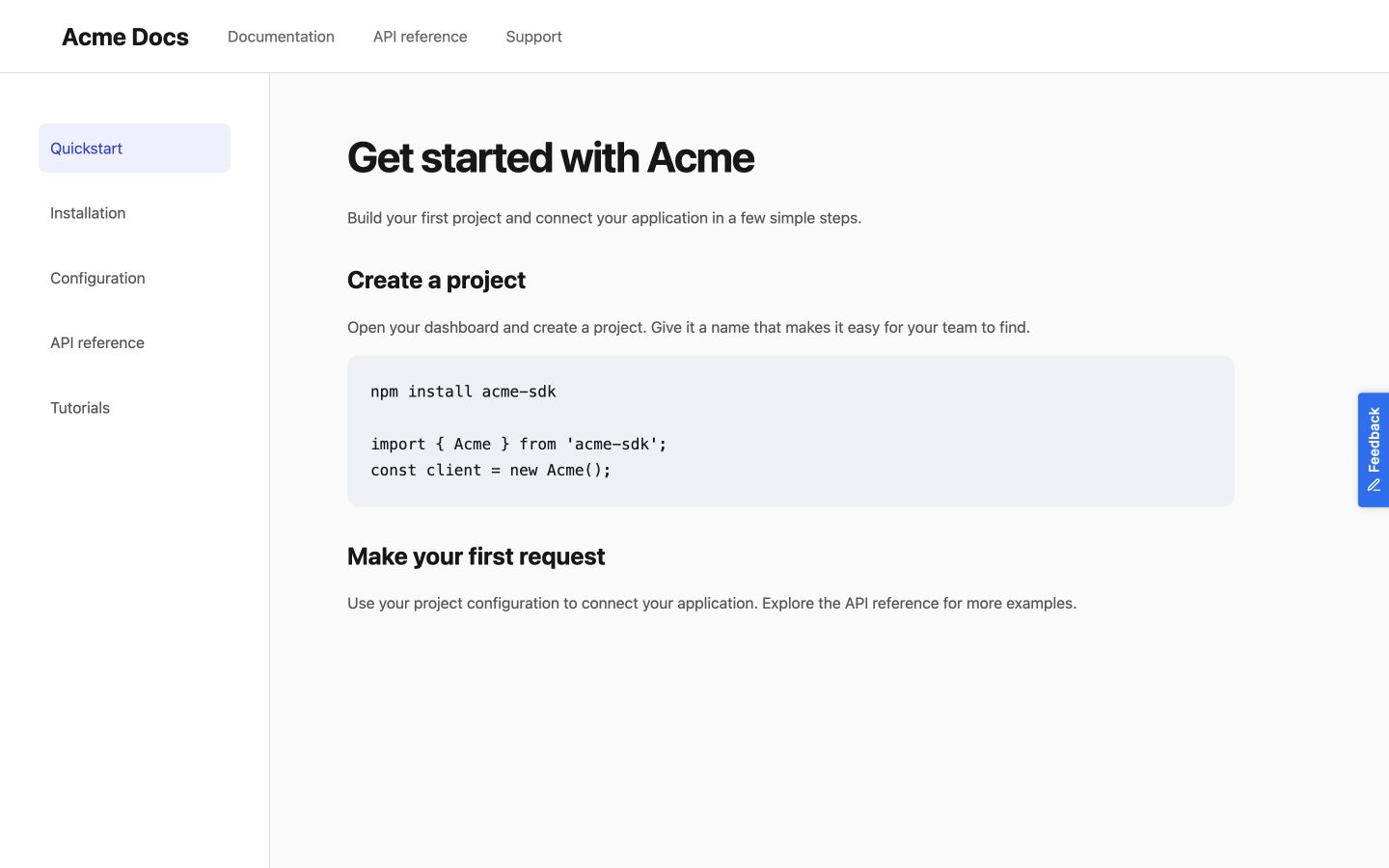
Floating button
-
Install PushFeedback:
npm install pushfeedback-reactinfoIf you're using yarn as your package manager, run
yarn add pushfeedback-reactinstead of the npm command above. -
In the main component where you wish to place the feedback button (often
src/pages/index.js), embed the PushFeedback button:import React, { useEffect } from 'react';import { FeedbackButton } from 'pushfeedback-react';import { defineCustomElements } from 'pushfeedback/loader';import 'pushfeedback/dist/pushfeedback/pushfeedback.css';const IndexPage = () => {useEffect(() => {if (typeof window !== 'undefined') {defineCustomElements(window);}}, []);return (<div className="page-layout">{/* Other components and content */}<FeedbackButton project="<YOUR_PROJECT_ID>" button-position="bottom-right" modal-position="bottom-right" button-style="dark">Feedback</FeedbackButton></div>);}export default IndexPage;Replace
<YOUR_PROJECT_ID>with your project's ID from the PushFeedback dashboard. -
Start your Gatsby app by running
gatsby developin your terminal. Once it compiles successfully, verify that the feedback button appears and functions correctly on your site.
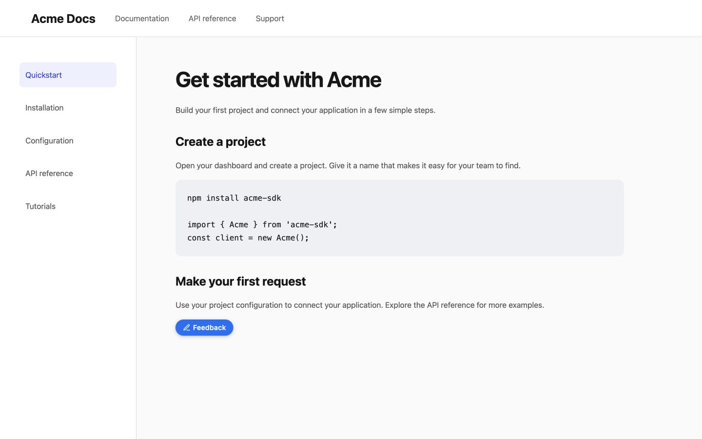
Inline button
Install pushfeedback-react if it is not already in your project:
npm install pushfeedback-react
Create InlineFeedback.jsx with the widget stylesheet, loader, and component:
import React, { useEffect } from 'react';
import { FeedbackButton } from 'pushfeedback-react';
import { defineCustomElements } from 'pushfeedback/loader';
import 'pushfeedback/dist/pushfeedback/pushfeedback.css';

export default function InlineFeedback({ project }) {
  useEffect(() => { defineCustomElements(window); }, []);
  return <FeedbackButton project={project} button-position="default" modal-position="center" button-style="dark">Feedback</FeedbackButton>;
}
Render <InlineFeedback project="<YOUR_PROJECT_ID>" /> where you want it in the content.
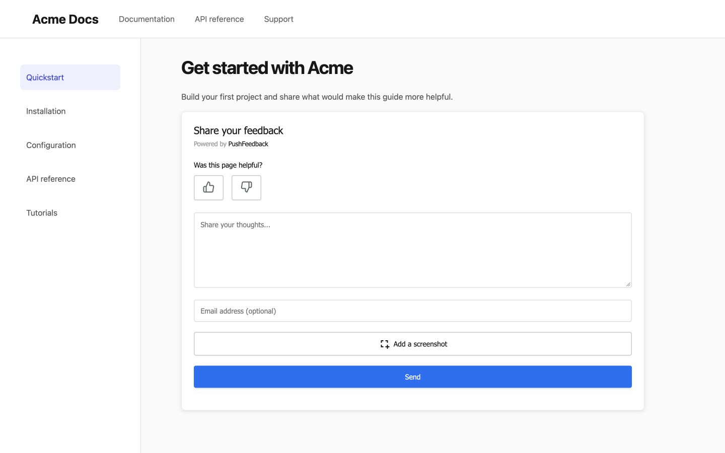
Embedded form
Install pushfeedback-react if it is not already in your project:
npm install pushfeedback-react
Create EmbeddedFeedback.jsx with the widget stylesheet, loader, and component:
import React, { useEffect } from 'react';
import { FeedbackModal } from 'pushfeedback-react';
import { defineCustomElements } from 'pushfeedback/loader';
import 'pushfeedback/dist/pushfeedback/pushfeedback.css';

export default function EmbeddedFeedback({ project }) {
  useEffect(() => { defineCustomElements(window); }, []);
  return <FeedbackModal project={project} embedded="true" />;
}
Render <EmbeddedFeedback project="<YOUR_PROJECT_ID>" /> where you want it in the content.
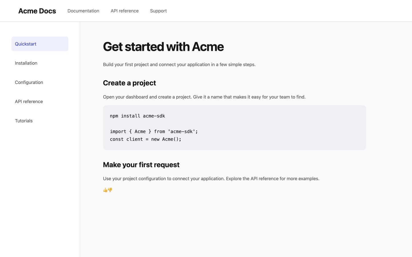
Like and dislike buttons
Install pushfeedback-react if it is not already in your project:
npm install pushfeedback-react
Create FeedbackThumbs.jsx with the widget stylesheet, loader, and component:
import React, { useEffect } from 'react';
import { FeedbackButton } from 'pushfeedback-react';
import { defineCustomElements } from 'pushfeedback/loader';
import 'pushfeedback/dist/pushfeedback/pushfeedback.css';

export default function FeedbackThumbs({ project }) {
  useEffect(() => { defineCustomElements(window); }, []);

  return (
    <div>
      <p>Was this helpful?</p>
      <div className="pushfeedback-thumbs-row">
        <FeedbackButton project={project} rating="1" button-position="default" modal-position="center" button-style="default" custom-font="true">
          <span className="pushfeedback-thumb-label">Helpful</span>
          <svg xmlns="http://www.w3.org/2000/svg" width="24" height="24" viewBox="0 0 24 24" fill="none" stroke="currentColor" strokeWidth="2" strokeLinecap="round" strokeLinejoin="round" aria-hidden="true"><path d="M14 9V5a3 3 0 0 0-3-3l-4 9v11h11.28a2 2 0 0 0 2-1.7l1.38-9a2 2 0 0 0-2-2.3zM7 22H4a2 2 0 0 1-2-2v-7a2 2 0 0 1 2-2h3" /></svg>
        </FeedbackButton>
        <FeedbackButton project={project} rating="0" button-position="default" modal-position="center" button-style="default" custom-font="true">
          <span className="pushfeedback-thumb-label">Not helpful</span>
          <svg xmlns="http://www.w3.org/2000/svg" width="24" height="24" viewBox="0 0 24 24" fill="none" stroke="currentColor" strokeWidth="2" strokeLinecap="round" strokeLinejoin="round" aria-hidden="true"><path d="M10 15v4a3 3 0 0 0 3 3l4-9V2H5.72a2 2 0 0 0-2 1.7l-1.38 9a2 2 0 0 0 2 2.3zm7-13h2.67A2.31 2.31 0 0 1 22 4v7a2.31 2.31 0 0 1-2.33 2H17" /></svg>
        </FeedbackButton>
      </div>
    </div>
  );
}
Render <FeedbackThumbs project="<YOUR_PROJECT_ID>" /> after the article content.
Next steps
Choose what to do next:
- Customization — Adjust the widget's layout, styles, and text.
- Integrations — Forward feedback to Slack, email, Jira, and more.